
There’s been a quite a bit of buzz recently about the fact that Google has been ramping up their mobile first indexing.
As we know, there are three types of SEO. Optimising your site for mobile-first indexing falls under the category of Technical SEO.
Search Engine Optimisation (SEO) is often seen as a bit of a dark art, and those who know the secrets of it will one day rule the world. Will this ‘mobile-first indexing’ be another thing to add to the SEO masters long list of terms that no-one else understands?
Nope.
It’s actually pretty simple and makes a lot of sense.
So, what exactly does it mean?
What is search indexing?
Search indexing is when Google (and other search engines) crawl the contents of your website to work out what your website is all about. These bots look at your images (including alt attributes), heading and page structure, content, tags, speed etc.
So, what is mobile first indexing?
Traditionally, search engines have crawled the desktop version on websites to use as their primary source of truth.
Mobile first indexing means that Google is now using the mobile version of your site to do this, which helps to determine your search ranking.
There are not two indexes (mobile and desktop). There is one index, and it is now based on mobile, not desktop. This update simply changes how content is added to the index that already exists.
Why now?
Mobile traffic has been steadily increasing for years. In 2016, mobile surpassed desktop to be the greater source of web traffic. From Google’s perspective, the vast majority of searches come from mobile now, so it makes sense that these are the results shown to their users.
How will I know if Google has started indexing my site for mobile first?
If you have Google Webmaster Tools setup, then you’ll get an email stating when mobile first indexing will commence on your site. As a slight aside, if you don’t have Webmaster Tools set up on your site, go and do it right now.
You will also notice increased traffic from Smartphone Googlebot in your Google Analytics console. As another aside, if you don’t have Google Analytics setup on your site, go and do it right now.
How do I make sure my site is mobile friendly?
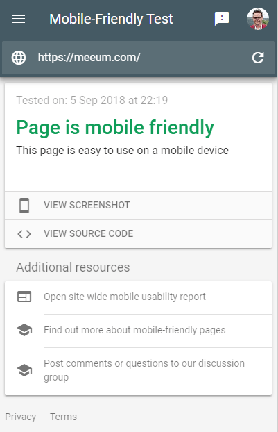
The Google Mobile-Friendly test results showing that meeum.com passed the test (that’s a relief).
Open your site on your mobile. Or better yet, get someone else to look at your site on their mobile and tell you what they think. That’s a pretty great test to do as there aren’t many harsher critics than a human eye (that’s not yours).
If you’re after a more technical perspective, you’re in luck, as Google have implemented a Mobile-Friendly Test, which is super simple.
Just head to https://search.google.com/test/mobile-friendly and plug your website in.
The tool will show whether your site is mobile friendly or not, and can sometimes offer tips on mobile usability.
Don’t use Flash
Flash is barely supported on any mobile platform these days, so any site that relies on Flash to display content will get a warning in the mobile-friendly tool.
Flash was once heavily relied upon for animations and navigation. These sorts of things can now be easily done with CSS animations and other code-based practices.
Make sure your viewport is configured correctly
Anyone who has done our longer workshops will know all about the meta viewport tag, how to set it up, and why it’s needed. The meta viewport tag tells browsers how to adjust the page’s dimension and scaling to suit the device.
Font sizes are too small for mobile
Make sure your font sizes scale well for mobile. A 14px font may look ok on desktop, but on mobile with an incorrectly configured viewport, the text will be illegible. This is also a big accessibility issue, so always make sure font sizes are nice and readable in any context.
Buttons and other touch points too close together
If you have buttons, links and/or navigation elements that are too close together on mobile, you’ll also get notified in the tool. The human finger is a fair bit bigger than the cursor at the end of a mouse. Delineating between two different touch points can be difficult on many websites that have these things too close together.
It’s pretty infuriating having to ‘pinch and zoom’ every time you want to use a site’s navigation because it’s been poorly spaced out.
Does mobile first indexing affect my SEO?
Yes and no. Probably not, but maybe.
SEO effects of mobile first indexing on a responsive website
If your site is responsive (the same codebase works well on mobile, desktop and everything in between), then you should be right as rain.
If the viewport width is set to a fixed-width (eg: 500px), then this will also be flagged in the tool. Viewport width should generally be set to device-width.
Some things to keep in mind:
- Some responsive sites hide content in mobile view – don’t do that.
- Just because your site might look ok isn’t everything. Make sure your images file sizes are as small as possible and that you’re keeping server requests to a minimum.
- Speed is imperative. Check it and optimise for a mobile experience.
If you’re unsure about any of that, pop into a workshop sometime as we run through this sort of thing in most classes.
Mobile and desktop websites (ie: two URLs)
If you have a mobile site (eg: www.m.your-site.com), as well as a desktop site, then it will be the mobile site that is indexed. This means that if you have different content between your sites (which you shouldn’t), then there’s a reasonable chance your desktop content may never be indexed.
Your users will still be sent to the appropriate version. So if someone clicks a Google search result from a mobile, they’ll be sent to your mobile site. If they click from a desktop result, they’ll end up on your desktop site.
To be clear, in both cases, the indexed content will be the mobile version of the site, even if Google shows the desktop URL.
Non mobile-friendly website
If you have a website that is not mobile-friendly (ie: it’s not responsive and is pretty sucky to use on a mobile), then yes, you should probably do something about that. Don’t panic too much as Google will still index your website (remember it’s mobile first not mobile only).
Google has stated that this will be a slow process and that for the most part, they’ll only transition a site to mobile-first indexing when that site is ready.
At this stage, there is no change to your index or ranking if you don’t have a mobile-friendly website.
BUT…
Having said that, if your site is still a horizontal scrolling mess in the near future, there’s a pretty good chance Google will demote you in their rankings. Don’t forget that Google’s whole existence relies on giving its users an amazing user experience. The majority of Google searches happen on mobile, and if those users get a degraded experience because your site is a bit of a mess, then that doesn’t look great to Google.
Considering the mobile usage stats listed above, you’d more than likely be losing traffic anyway, which affects SEO rankings.
Desktop only sites traditionally have larger images, videos etc, are not as optimised as mobile-friendly sites and don’t look great on smaller devices. So although Google may not decrease your rankings because you don’t have a mobile site, they may downgrade you for all those other reasons.
Also, your competitor’s website probably is mobile friendly and they’ve more than likely just overtaken you in the rankings.
If you’re keen to get your site up to speed, why not book into a workshop, or get in touch to discuss a private consult?
 Now a digital veteran, Sam Hemphill initially trained as a drummer and high school teacher and spent 10 years as a touring musician and tour manager.
During that time, he...
Now a digital veteran, Sam Hemphill initially trained as a drummer and high school teacher and spent 10 years as a touring musician and tour manager.
During that time, he...