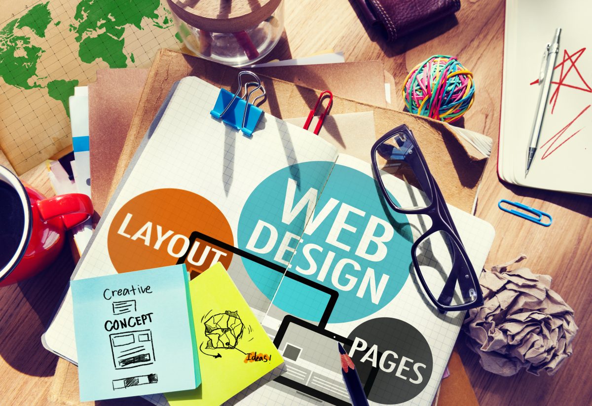
When people hear the term “Web Design”, most tend to associate that with colours, page layout, fonts and other terms based on aesthetics.
The reality is that Web Design as a craft goes far deeper than that, as we’ll discover in this resource.
Whether you’re using a drag-and-drop tool like Wix or Squarespace, or jumping in and coding it yourself, there’s more than just colours to think about.
The thing about drag-and-drop tools is they quite often do a pretty great job of handling many of the aesthetic decisions for you. That’s the point – give them some basic guidance around colours and those products will give you a beautifully laid out, mobile-friendly website in minutes.
What those products don’t do is what we’re going to talk about today.
This is what we’ll be covering:
- Which website builder should you use?
- Tone of Voice
- Brand Guidelines
- Think like your user (UX)
- Sitemaps and site structure
- Give your reader something to do at the end of each page
Which website builder should you use?
There are some fantastic free and low-cost tools out there to build websites with. Sometimes there are called Content Management Systems, or CMS.
A CMS is a web-based tool that allows people to create and edit their website content without any coding knowledge. Typically, a CMS supports multiple users who can be location and device-independent, meaning that you can log in from a beach in Bali and your business partner can log in from a mountain in Peru (assuming you both have an internet connection and there’s not a worldwide pandemic going on).
The beauty of these systems is that anyone can have a great looking website up and running in almost no time at all.
As far as which CMS to use really depends on your needs. It’s like asking “what sort of car should I buy?”
The question you should actually be asking is “what problem am I trying to solve?”
Are you wanting to start a blog or a portfolio? Do you need e-commerce functionality to be able to sell your wares? Do you want the ability to get into the code to really customise the site beyond the basic drag-and-drop functionality?
Both WordPress and Wix offer free plans so you can have a pretty good play around with them without risking any financial cost. The free versions do lack features though, so you’ll likely want to upgrade at some point.
They’re both good platforms for blogging and can have e-commerce added if you need it. Personally, I prefer WordPress over Wix, but that’s also because I have a tech background. Wix is arguably a lot easier to use, but harder to extend.
In many of the Web Design classes that I teach in the tertiary sector, Wix and WordPress are the two flavours of choice with students. This is mainly due to being able to work on their sites over an extended period of time without forking out any dollarbucks. Many continue on and use their assessment websites for business purposes, so that’s a win for everyone.
Other products like Squarespace and Shopify have initial free trials and then are paid services. Both Squarespace and Shopify are excellent systems and have code access on the pro plans should you require it.
All the products listed have excellent support and a massive user community.
How to decide between Shopify, Squarespace, Wix and WordPress
My recommendation is to give them all a go. Think about some basic objectives and spend a couple of hours on each seeing what you can do – set up a couple of pages, change some colours and see which product works the best for you. It’s a few hours of your time now that will save many hours of possible frustration down the track if you find your chosen tool doesn’t behave how you expect.
Both a Ferrari and Hiace will get you from Melbourne to Sydney – it all depends on what you are trying to achieve that will dictate which is the better car. Same deal here.
A couple of additional quick notes before we go any deeper:
- If you’re not setting up an online store, then you can skip Shopify
- If you need the ability to really customise your templates via code, then steer clear of Wix
If you have some websites you love and you’re curious about what product was used to build them, then type the URL into WhatCMS to find out.
Create a free Wix website Create a free WordPress website Start a Squarespace free trial Start a Shopify free trial
The most important things to think about before you even sign up to a CMS…
Every business should have a website. For many people, websites are also a great way to present a portfolio when looking for work.
We love website builders, and we also love coding.
No matter how you choose to build your site, these are some important things to think about first:
Tone of Voice

This may seem obvious to some, but it is a very important part of the design of your site.
How do you want to be heard? What do you want to sound like?
Are you easy-going or quite serious? Educational or satire?
It’s not about what you’re saying, it’s about how you say it.
One of the best ways to start to define your tone of voice is to write how you talk (that’s how we do it). For most small businesses this is pretty straight forward as there’s usually only one or two public-facing people in the business.
For larger businesses, this sort of thing should be codified, much like Mailchimp have done. They’re a massive company, but with defined tone of voice guidelines, all of their material sounds like it’s coming from the same voice.
Thinking about this early is also a great start for having awesome SEO friendly content.
Brand guidelines

Your brand guidelines specify everything that plays a role in the look and feel of your brand. While the most basic of brand guides can include aesthetics like company colours, fonts, and logos, there’s a lot more you can include to ensure brand consistency.
Branded photos, particular spelling and mission statements are all things to think about here. Businesses will sometimes call these design systems or style guides.
Consistency is key when thinking about your brand guidelines. It’s also important to think about your long term strategy, not just this project. If you make your website green and red, does that also tie in with your social media profiles and shopfront?
As an example, our main branding colours are blue (#2e3561), dark grey (#222222), white (#ffffff) and occasionally orange for highlights (#e46c2e). We use Roboto and Roboto Condensed as our fonts. This is consistent across this website, all of our social media, printed assets, marketing and workshop materials.
Don’t be afraid that you’re going to lock yourself into a corner with this – brand guidelines can easily be updated. We used to use light blue branding and a totally different font set. In 2019 we made the decision to rebrand with these new colours and updated all of our assets accordingly. If you’re curious about our old branding, just head to our Instagram profile and scroll back in time.
To see some great examples of branding guidelines, check out the guidelines and resources of Spotify, Uber and Facebook.
Also check out this excellent article from Airbnb that delves into their process of creating a new design system.
If you’re really curious about design systems and how to implement them well, then I highly recommend Atomic Design by Brad Frost as a great read.
Look at your website through your user's eyes

User Experience (UX) design is the process of giving our customers, clients & users the best experience possible.
As yourself “why would someone come to my website?” Think about the sort of information they’re likely to be looking for.
Some examples:
- If you’re an author, people may want to find more about you, how to get in touch, and of course, how to buy your books.
- Someone visiting a cinema website wants to know what’s playing and when (and where the cinema is).
- Someone visiting a takeaway restaurant website would want to find menus, contact details, reviews and delivery area.
- A music fan looking at a band website would likely be looking for gig dates as well as ways to buy and stream music.
When trying to look objectively at your own site through the eyes of your core reader, always remember that you are not your user. This is very common and is known as the False-Consensus Effect when website owners project their expectations and opinions onto users.
As an example, if you’re a wedding photographer, you do not need to have hundreds of wedding photos on your website. Show a few of your best and if people really want to see more they’ll ask. If you think you need 100 photos, think about whether it’s your ego or your potential customer who wants them there (it’s your ego).
If you’re an accountant and you say you can help with CGT, BAS, and ASIC registration, explain what that all means. Many people have no clue what your business jargon means, even though they may well need help with it. Make sure you explain concepts that your typical user may not fully understand.
Comprehensive user research is always a great idea when working out the best way to communicate with your audience. One simple way to do this is just by asking a few friends to take a look at your website content. Seek their honest feedback and listen to it.
Once you have some good ideas of what content your user needs, make sure you account for that in your website structure, which we’ll chat about next.
Sitemaps and navigation structure

Related to the above notes about thinking like your reader – have a good think about your site structure. This means having a think about what pages your website will have, and what hierarchy they should have.
Your site structure is important and has significant ramifications for the User Experience (UX) of your website, as well as Search Engine Optimisation (SEO).
The menu navigation on websites exists to help us find content and it should be simple and intuitive. Have a look at some of your favourite websites and you’ll likely find they’re pretty easy to use because most things you want are listed in the main navigation.
Note that when we’re referring to site structure, we can also be referring to apps.
Some tips on creating a sitemap
- Plan your sitemap thoroughly before you start designing or coding (but don’t be afraid to change it if you feel it needs updating)
- This is a great exercise to do if you’re planning on having someone else design or code your site as well, as it can answer (and bring up) a lot of questions straight away
- An easy way to start is by writing out your page structure in something like Excel, Word or Google Docs
- Be sure to use easy to follow language in your navigation
Some other tools that can help with creating a site structure or sitemaps include Gloomaps or MockFlow.
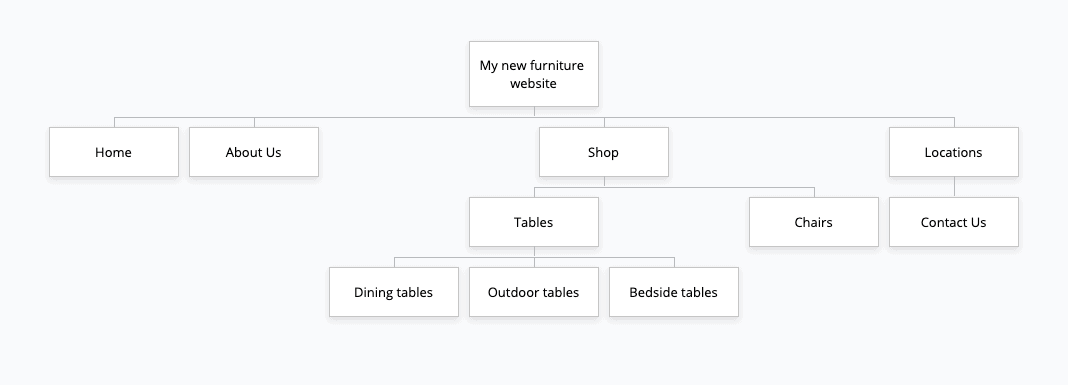
A sitemap created with Gloomaps
Always give your reader something to do

One thing that’s frequently forgotten in website design is encouraging the user to do something once they have finished a task. This is known as a Call to Action or CTA.
A CTA can really be anything that encourages the user to do something. Having a CTA at the end of each page is a great way to increase a users time on site which is one the big goals of having a website in the first place.
Some examples of effective CTAs include:
- Links to related articles
- Links to related products or services that you sell
- Email newsletter signup forms
- Contact details / links to contact page if the reader wants to get in touch about the page content
You may notice the at the bottom of every resource on this site, there is at least one CTA. Each page has a newsletter signup form. For articles on a certain topic, we’ll quite often link to similar articles that the reader is likely interested in. Sometimes we’ll link to relevant products or services as well. As an example, most articles about SEO will have a CTA at the end linking through to our SEO book. Other articles might link to our mentoring services or other related resources.
Make great websites
As you can see, there’s a lot more to think about than just which website builder to use.
The most successful websites are the ones that take this sort of thing into account. Think like your user, give them things to do and help them on their journey.
Sort those things out and then sign up to a website builder to make the best website you can.
Create a free Wix website Create a free WordPress website Start a Squarespace free trial Start a Shopify free trial
Aaaaaaaaaand here’s the CTA…